BRIGHTS v PASTELS
Two very definite colour trends are emerging for homeowners in search of a summer interiors refresh
While one is bold and brilliant, the other cool and calming, both brights and pastels provide a fresh and optimistic outlook for interior styling.
Here’s how to incorporate both colour trends into homes, according to experts at three leading home interest brands.
Interiors expert Lorna McAleer from www.stylestudio.co.uk advises: “Pastel hues make homes feel fresh and inviting and can be very calming colourways. Tones like dusty pink, jade and sage create beautiful, light-filled spaces making rooms feel bright and airy.
“Ideal for smaller homes, pastels are also great for anyone who’s cautious about using colour in the home but wants to step away from neutrals. If it’s a first foray into the world of colour try Style Studio’s Ice range, a three coloured collection that’s neutral with a hint of a tint!”
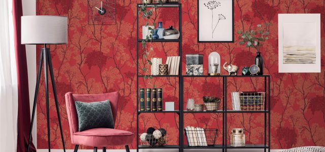
“In contrast, bright colours look just brilliant at windows. And the sun shining through makes colour appear even more intense. There are hundreds of bright hues to choose from in our extensive collections from vivid coral to mimosa and fresh apple.”
Head of design at iwantwallpaper.co.uk Alex Whitecroft adds: “Whatever your style and type of property there’s a pastel or bright wallpaper to match it.
“From feathers to florals or faux wood to painted brick effects, pastels give walls an instant lift. Pastels also work brilliantly with geometric prints – the graphic details and soothing colours are a winning combination.”
“Looking on the brighter side of life, literally anything goes. There are some killer colours coming into play for the remainder of 2019. Hot fuchsia pink, deep terracotta, scarlet and even neon shades are all making a comeback. Throw in some animal skin or a bold floral print to create a show-stopping maximalist scheme.”
Design Director at therugseller.co.uk, Daniel Prendergast, explains: “Powder pink and baby blue rugs are becoming really popular, these colours are a gorgeous summer update, especially for shaggy rugs or those that have a bit of sparkle weaved through. Pastels also provide a contemporary twist for Art Deco styling – one of summer’s hottest trends – my top pick would be the Medina rug, which features a stunning trellis design in soft baby pink and cream colourways.
“A rug is one of the easiest ways to inject a large expanse of colour. There’s no time-consuming painting and pasting, just pop it on the floor for an instant pick me up and change it when you’re ready for a new look.”
“Pick a colourful rug to inject colour and visual interest then build upon this, adding as much or as little colour to the room as you feel comfortable with.”
“We’re seeing homeowners getting more daring with how they use colour in the home, either with surprising combinations or introducing vivid tones that bring richness and depth to rooms. Pattern is similarly experimental with many homeowners mixing and matching patterns within a room scheme.”
“Extroverts and more established colour lovers love the eclectic and flamboyant look. Throw out the rule book by mixing stripes, florals, checks, geometrics – in fact, any pattern, in any scale can be combined.”
www.therugseller.co.uk
www.iwantwallpaper.co.uk
www.stylestudio.co.uk